Matchbox Design Inspiration
Last updated November 19, 2024

Written by Nick O’Brien
Thinking of creating your custom match boxes
for your event or company?
As matchbox printers ourselves, we’ve seen some incredible designs and brand identities come in from designers and creative agencies across the world.
Here are some rough ideas worth considering when creating your matchbox design.
for your event or company?
As matchbox printers ourselves, we’ve seen some incredible designs and brand identities come in from designers and creative agencies across the world.
Here are some rough ideas worth considering when creating your matchbox design.
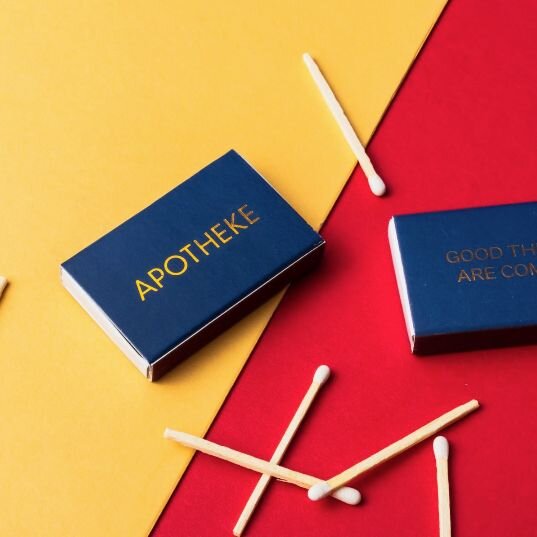
Solid Color Matte Coating with Foil
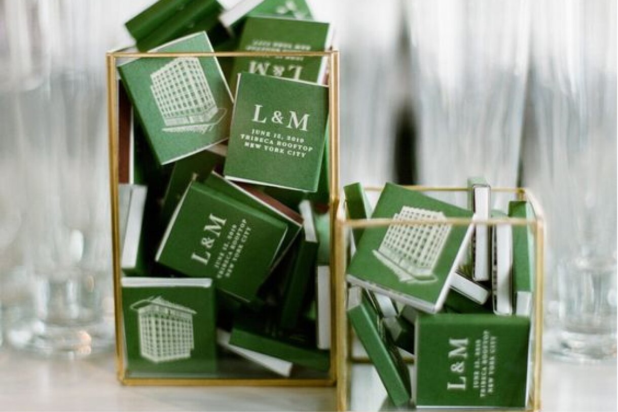
The most classic high quality feel can come from a solid brand color for your background printed with full coverage and a gold foil print.
Adding a matte lamination or coating allows you to create high contrast with the shiny foil stamp. If you were to foil stamp on a glossy surface, the two shiny reflections would wash themselves out and the foil wouldn’t be noticeable. With the ‘dull matte’ background here, the foil really pops and shines for the sun in all her beauty. Also, you can foil stamp both your logo and the text information all at the same time.
Adding a matte lamination or coating allows you to create high contrast with the shiny foil stamp. If you were to foil stamp on a glossy surface, the two shiny reflections would wash themselves out and the foil wouldn’t be noticeable. With the ‘dull matte’ background here, the foil really pops and shines for the sun in all her beauty. Also, you can foil stamp both your logo and the text information all at the same time.
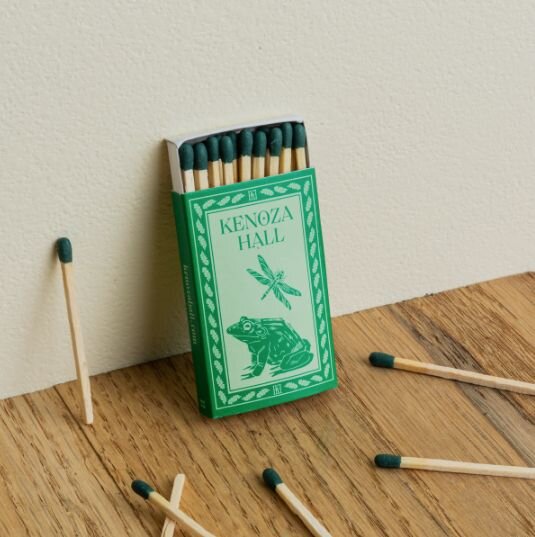
Nature vibe design with animal characters
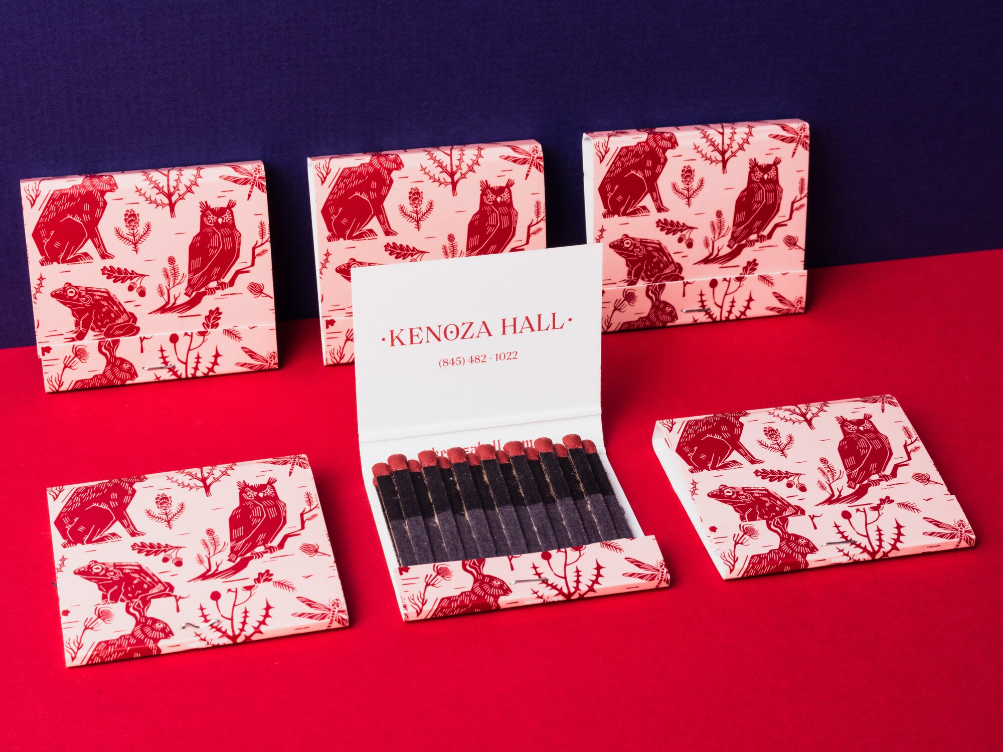
Here for Kenoza Hall, an upstate NY boutique hotel, they used outdoor design elements together with their logotype and animal characters. Matching the matchtips color to the primary design color, forrest green, is a great way to tie the look together. Can anyone argue that forest green is not the official color of the outdoors?
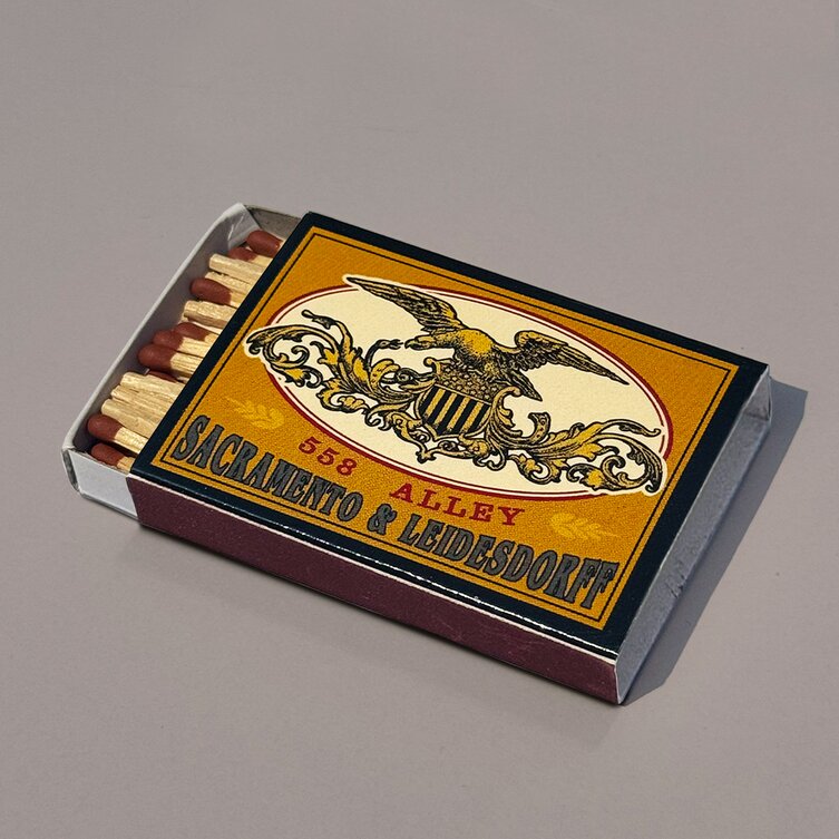
Old factory look with old western font type
These vintage ‘seals’ and flag designs also make for a secondary brand element to a primary old school serif logotype, like here for Sacrament & Leidesdorff.
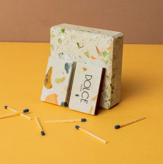
Stone Marbling as Your Background
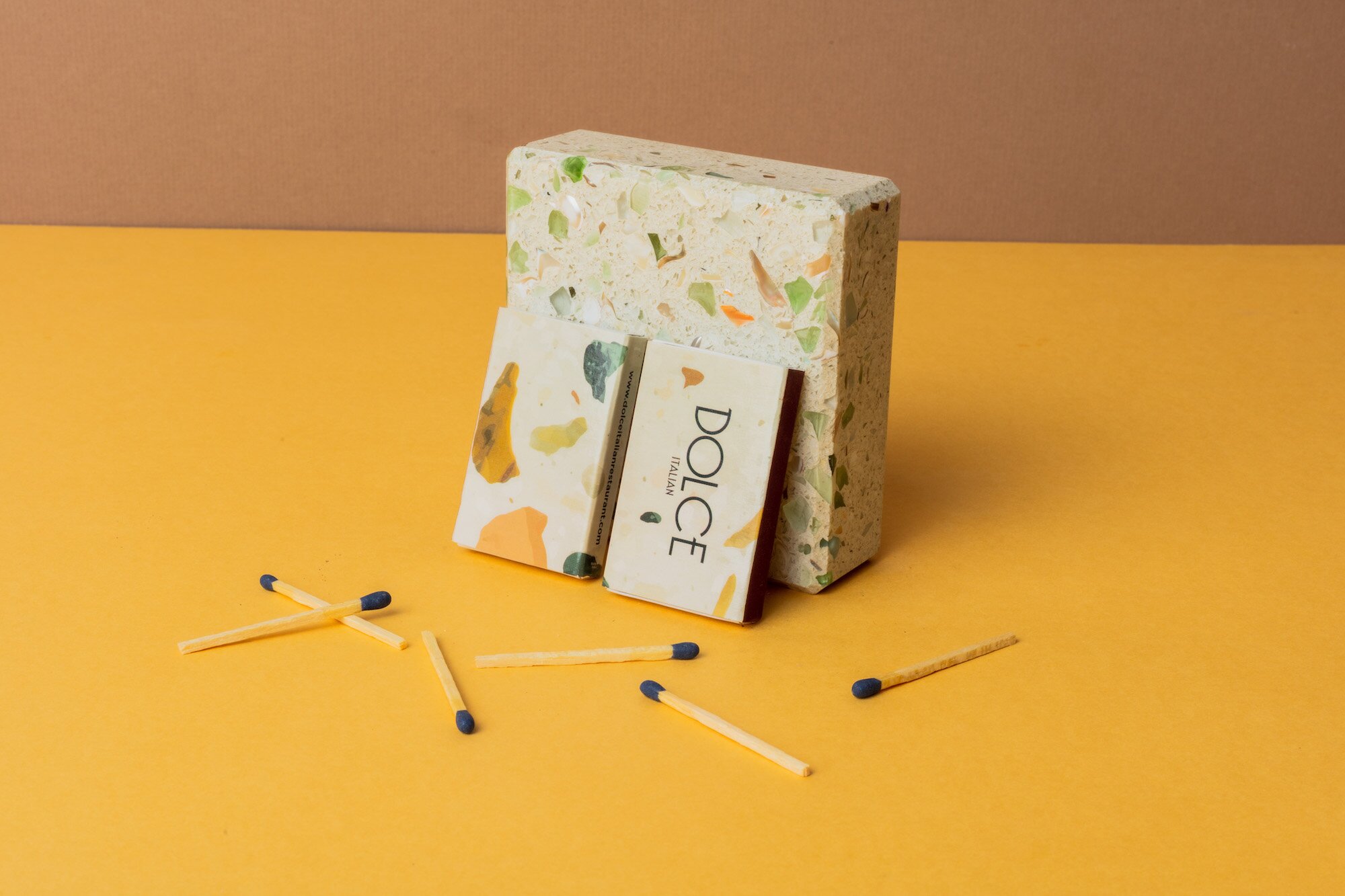
Find a great stone marbling pattern to set as your background, and palce your design large over top. Just be careful with any small type that the type color doesn’t match the stone color behind it. That would make it really difficult to read your type design.
Join our newsletter
Get access to our best deals, tips, and inspiration
No spam, we hate it more than you do.
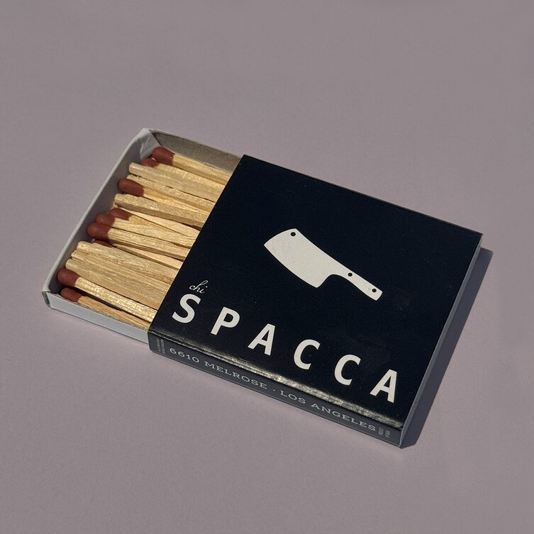
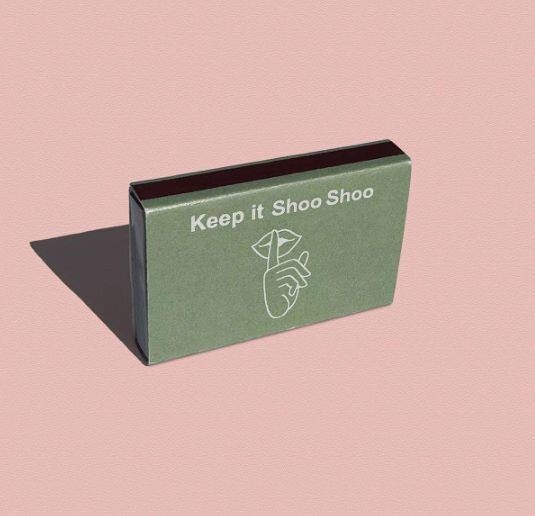
Black and white large type and icon
Another classic matchbox design where you have a solid black and white design with a large logotype and large brand icon. Using the side of the box for your address or social handles.
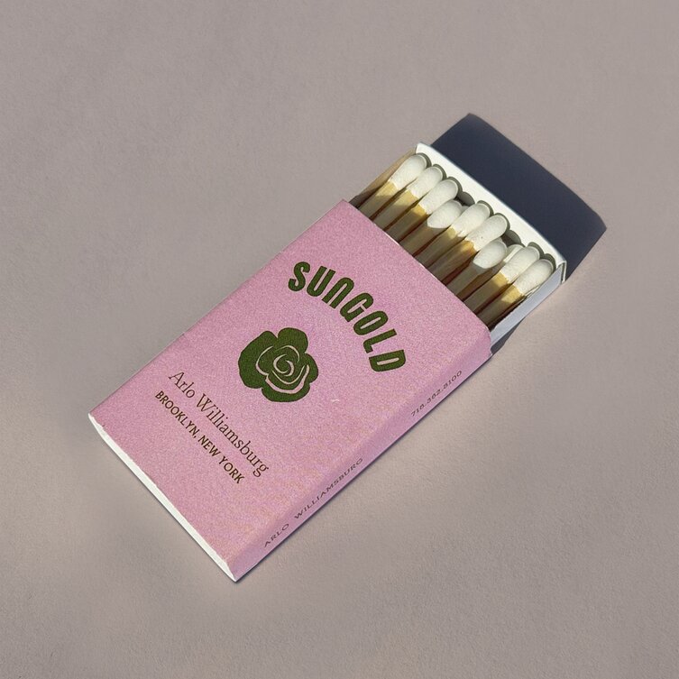
Logotype + floral icon + info
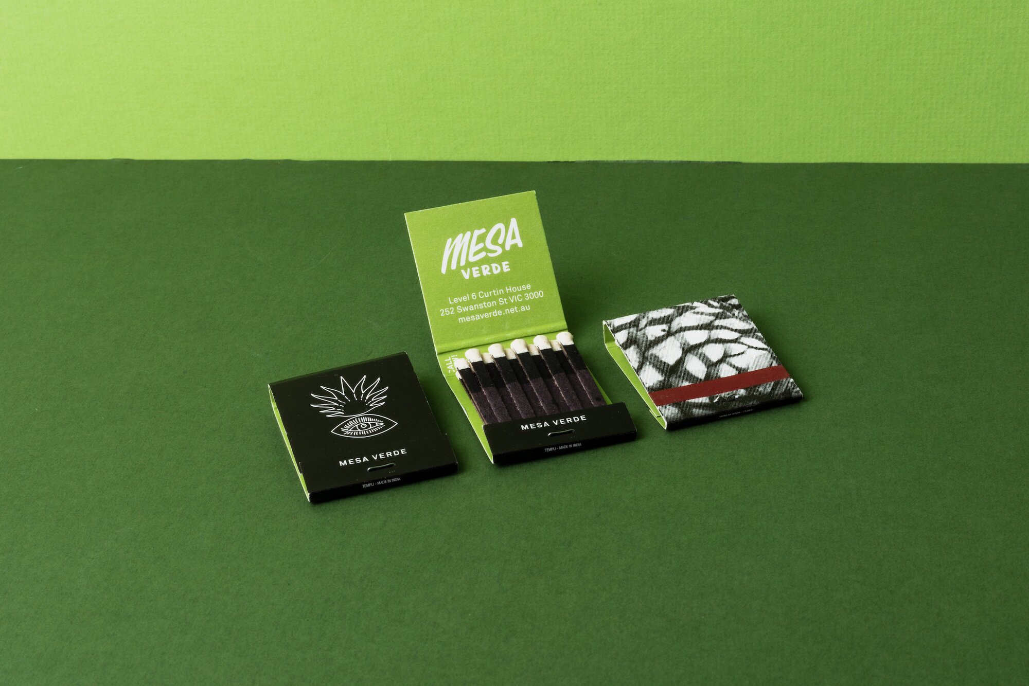
Using a solid brand color for your background, you would add a combination of logotype + flower icon + address or website info.
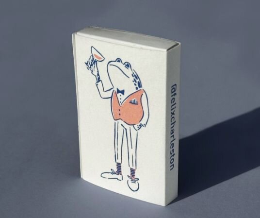
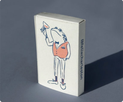
Large brand character enjoying a cocktail
Matchboxes are mostly found in fun party environments like a bar, restaurant or wedding. Lean into that vibe with a fun character, maybe one very on brand for you and give him or her a cocktail or drink. Here they did a wise toad bartender inspecting a drink he just made. Who wouldn’t love that!?
I hope you enjoyed these and got some inspiration for your matchbox design. Going with the classic will usually get you to a great final look. Don’t be shy about adding your own personal statement with a design element that means something dear to you.
Join our newsletter
Get access to our best deals, tips, and inspiration
No spam, we hate it more than you do.
