The Difference Between Coated & Uncoated Print Colors
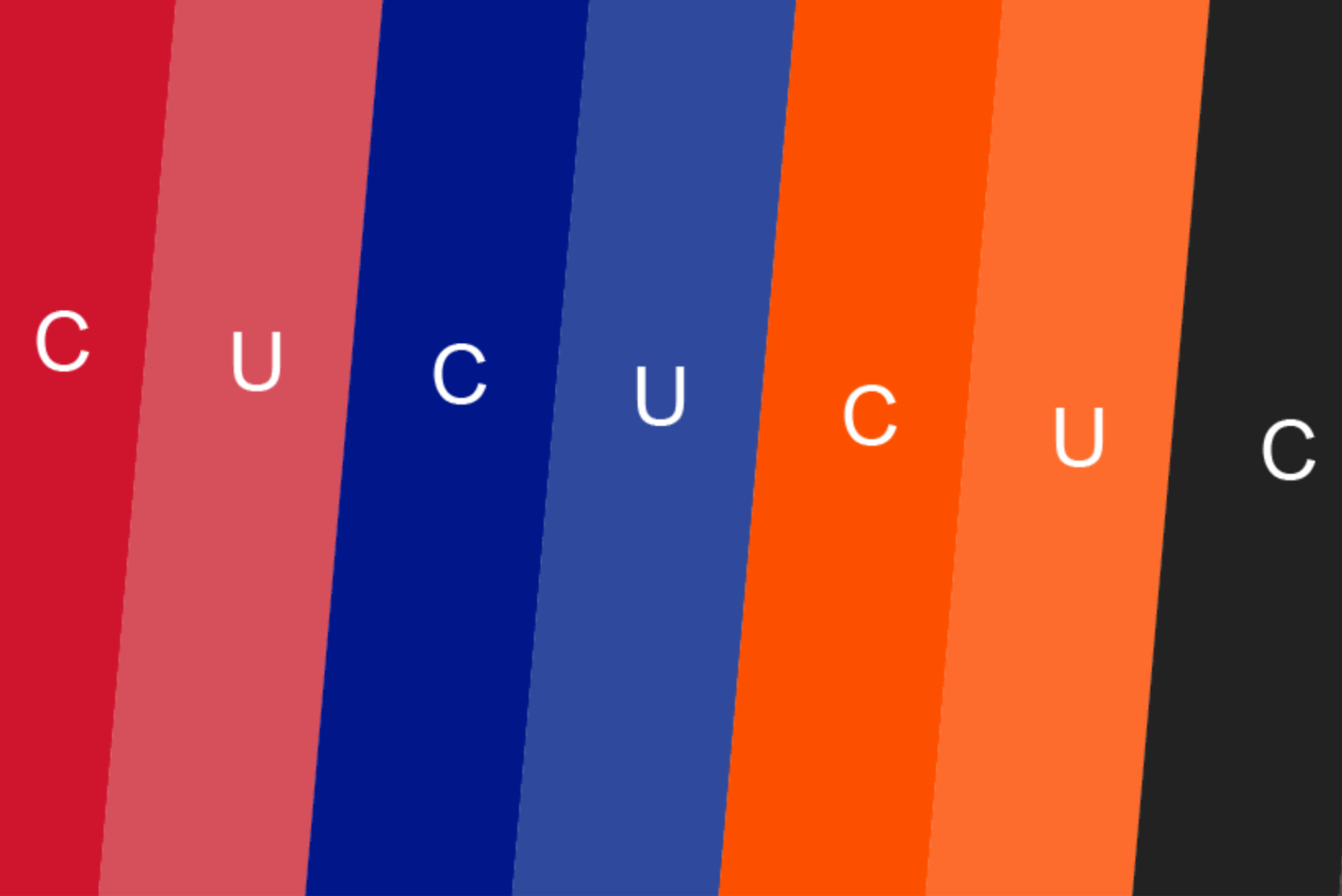
Pantone®, also known by the acronym PMS, segregates unique colors into numbers. For example; Pantone® 186 Red would be your brand identity color, as opposed to just ‘Red’. This ensures your brand color stays consistent through various printed items.
But then you’ll also see your 186 Red sometimes displayed as 186 U or 186 C.. And you’ll notice that the ‘U’ and ‘C’ versions look different. ‘U’ will appear more dull and muted, where ‘C’ will pop more and show brighter.
Pantone® U = Uncoated
Pantone® C = Coated
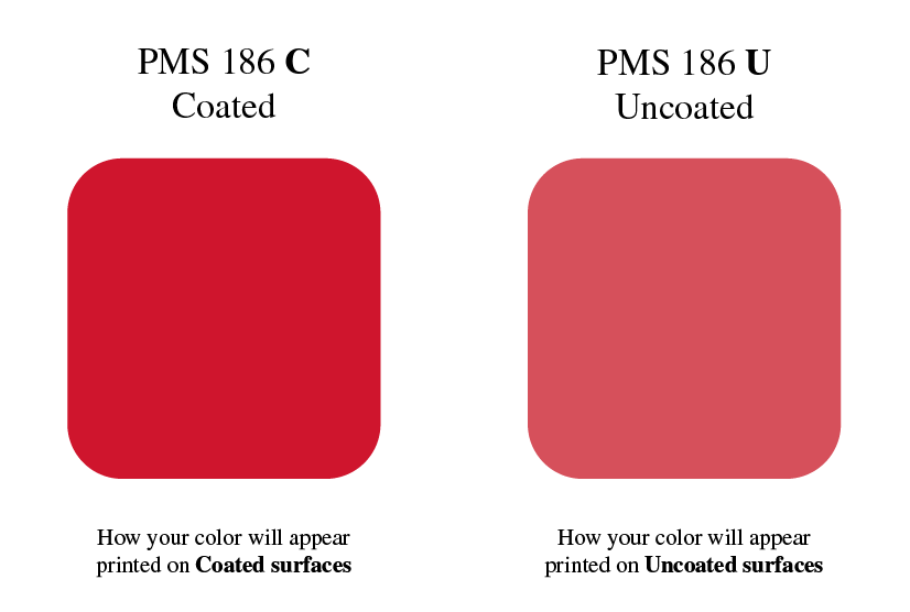
so why are there two versions of the same color??
It’s because the same color appears in real life, differently, when it’s been printed on Coated surfaces then it does printed on Uncoated surfaces.
Uncoated surfaces
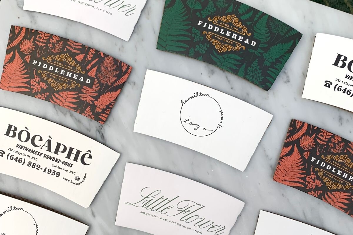
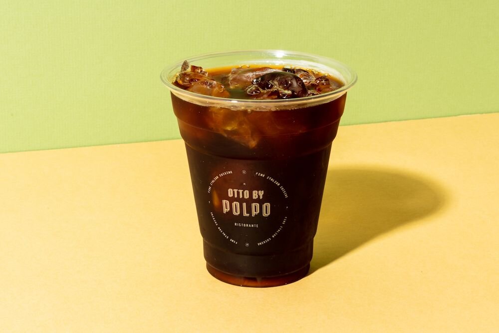
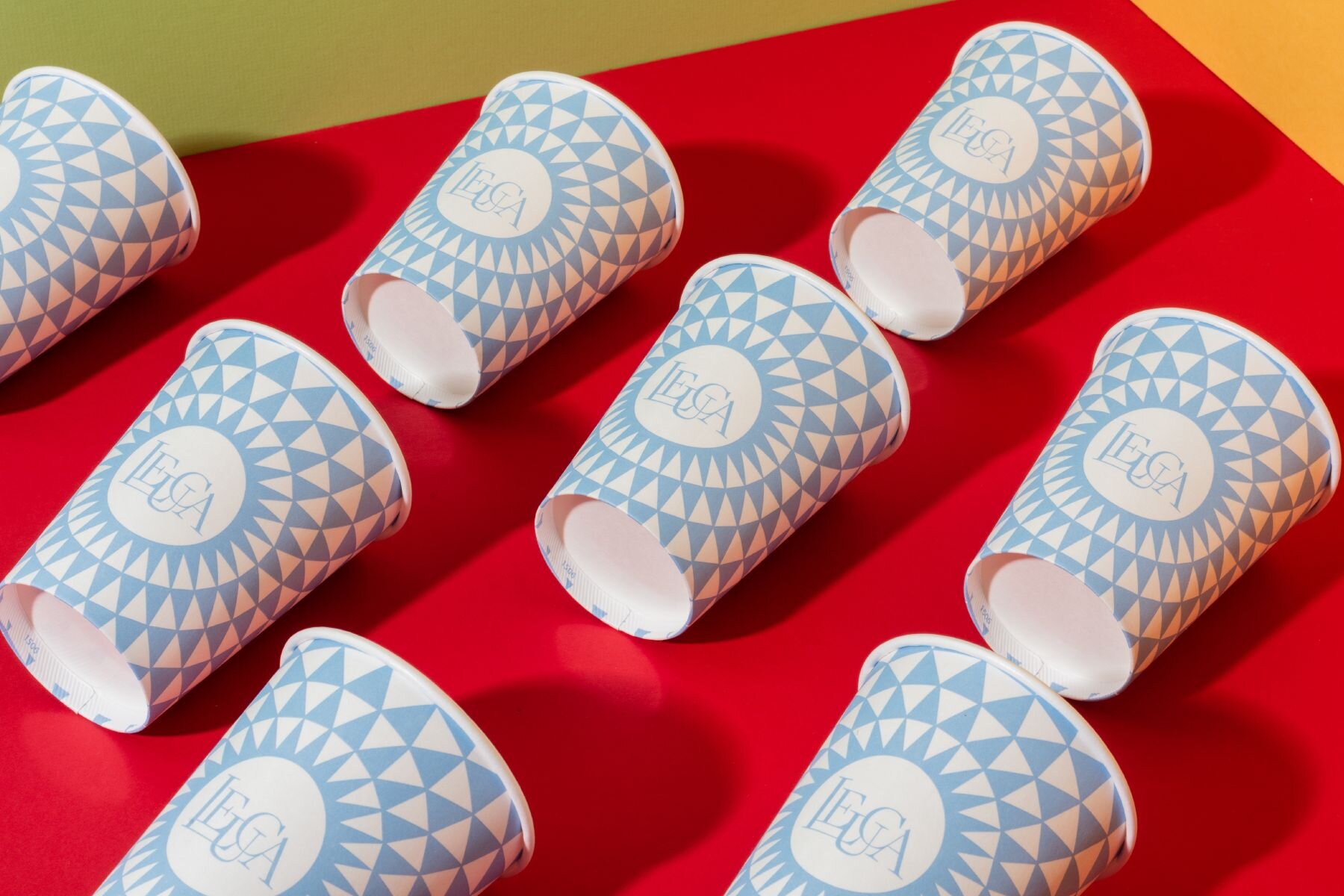
- Coffee Cups
- Paper bags
- Kraft paper takeaway packaging
- Any paper that’s referred to as ‘uncoated’ or ‘vellum’
- Any high end business cards or stationary
- All types of paper bags or paper packaging, which are made from kraft paper
Coated surfaces
- Labels or stickers
- Any paper with a gloss, matte or UV coating.
- Any coated papers
- All screen printing, so t-shirts and sweatshirts
- Promotional swag items like pens or mugs
- Signage, decals and banners
- Cold Cups
Why do colors appear different on different surfaces?
Think about your ink like a drop of water.. If dropped on a table, it will sit on top. If dropped on your skin, most of it would be absorbed. Coated surfaces allow the ink to ‘sit on top’, staying more true to its bright color. Uncoated surfaces will absorb the ink, causing it to lose its luster and appear slightly dull. There’s nothing that can be done to change this natural surface effect.
When the printer is purchasing ink to run your job, say Pantone® 186 Red.. in fact, they just order it as 186 Red, they don’t order ink as uncoated or coated.
Coated and Uncoated versions of a color are only used to display the color on screen for your reference as to how it will appear on the final product.
For these reasons, it’s important not to get too hung up on how your color appears on screen as coated or uncoated. All you need to know is that your print color will naturally look more dull when printing on uncoated and kraft surfaces and will look brighter and pop more when printing on coated surfaces.
